"The Bird Machine" is a urban apparel store sporting clothing from the 90's to now with various styles and custom brands. This would be seen in malls as well as stand alone stores, with a generous price range.
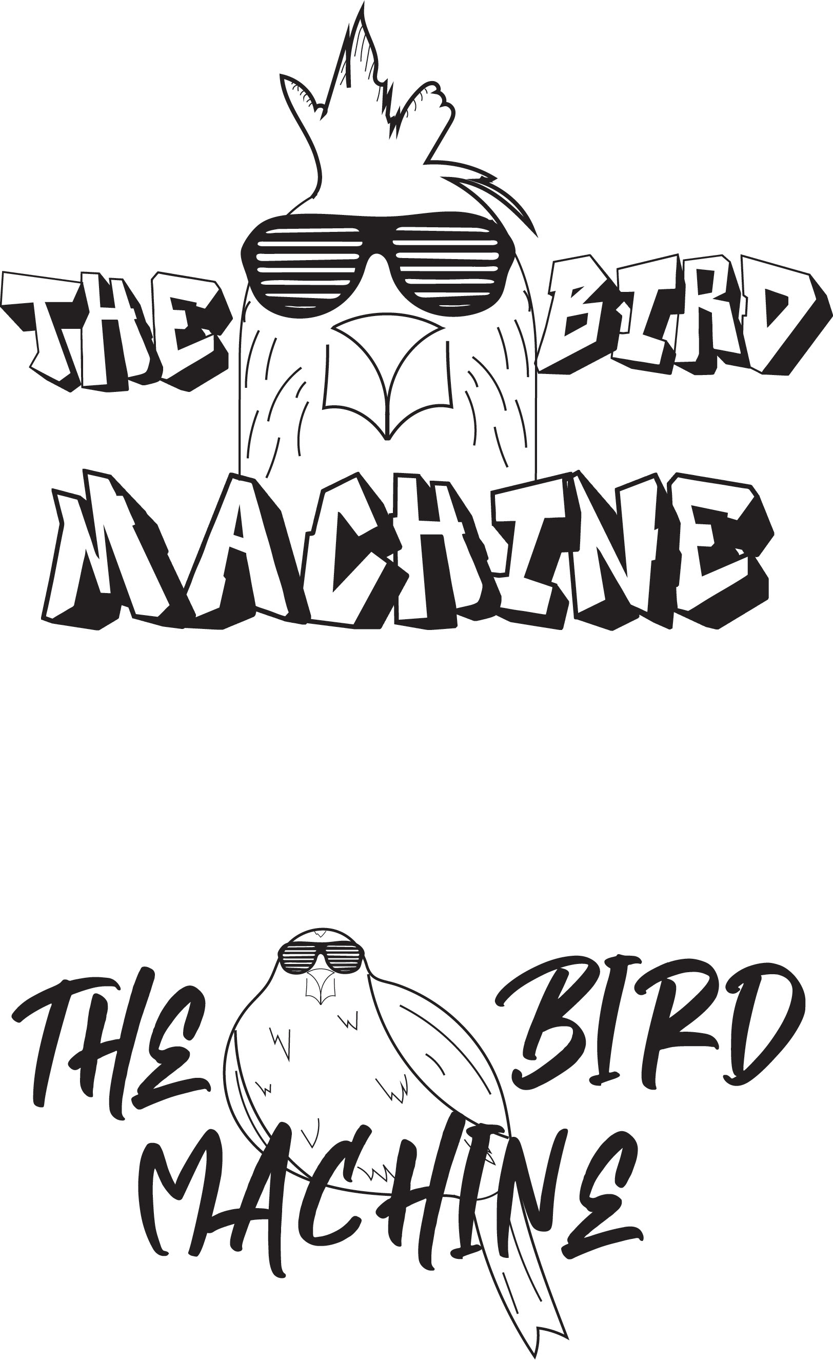
The initial design called for the use of a bird, one a chicken, and two a finch. The font would be in a graffiti style since it has an urban feel. The addition of shutter shades as old school feel from the 90's.
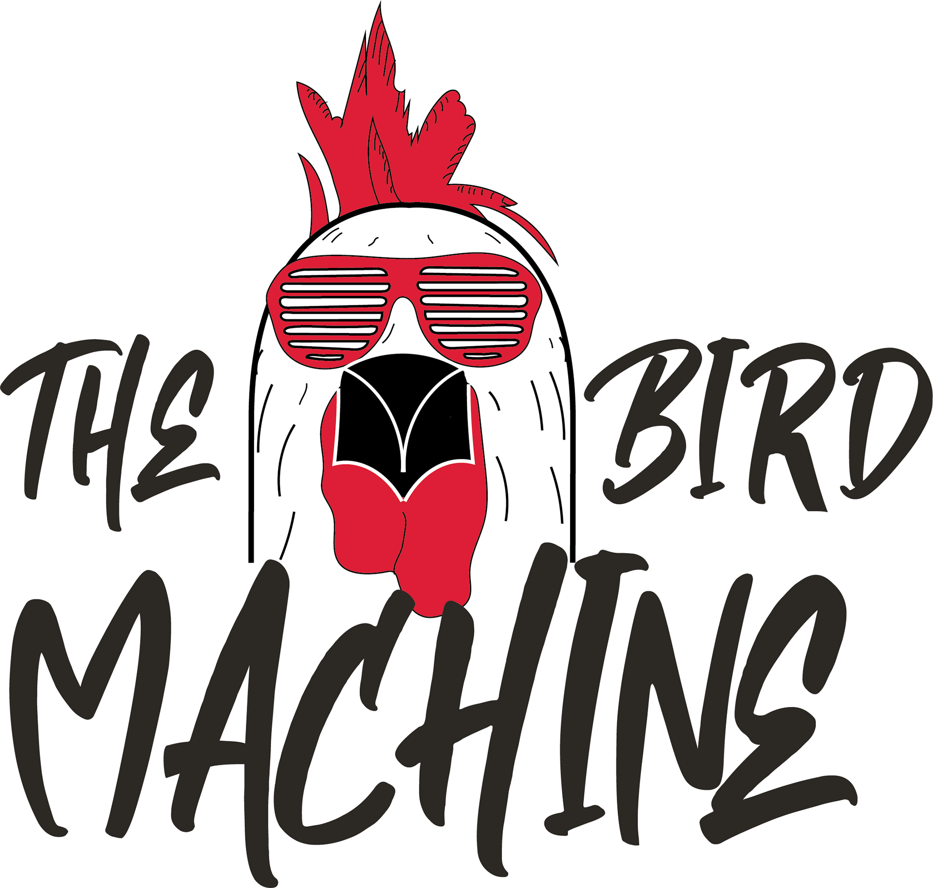
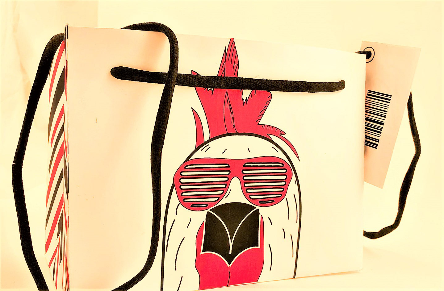
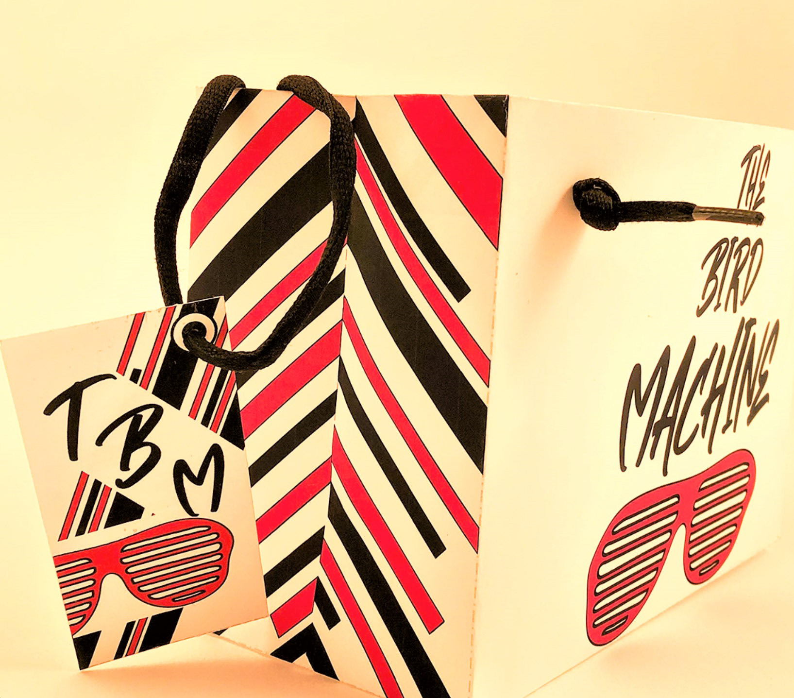
The chicken was chosen while the font from the second design was used instead of the previous font. Two tone colors of Red, Black, with a white background and outline.
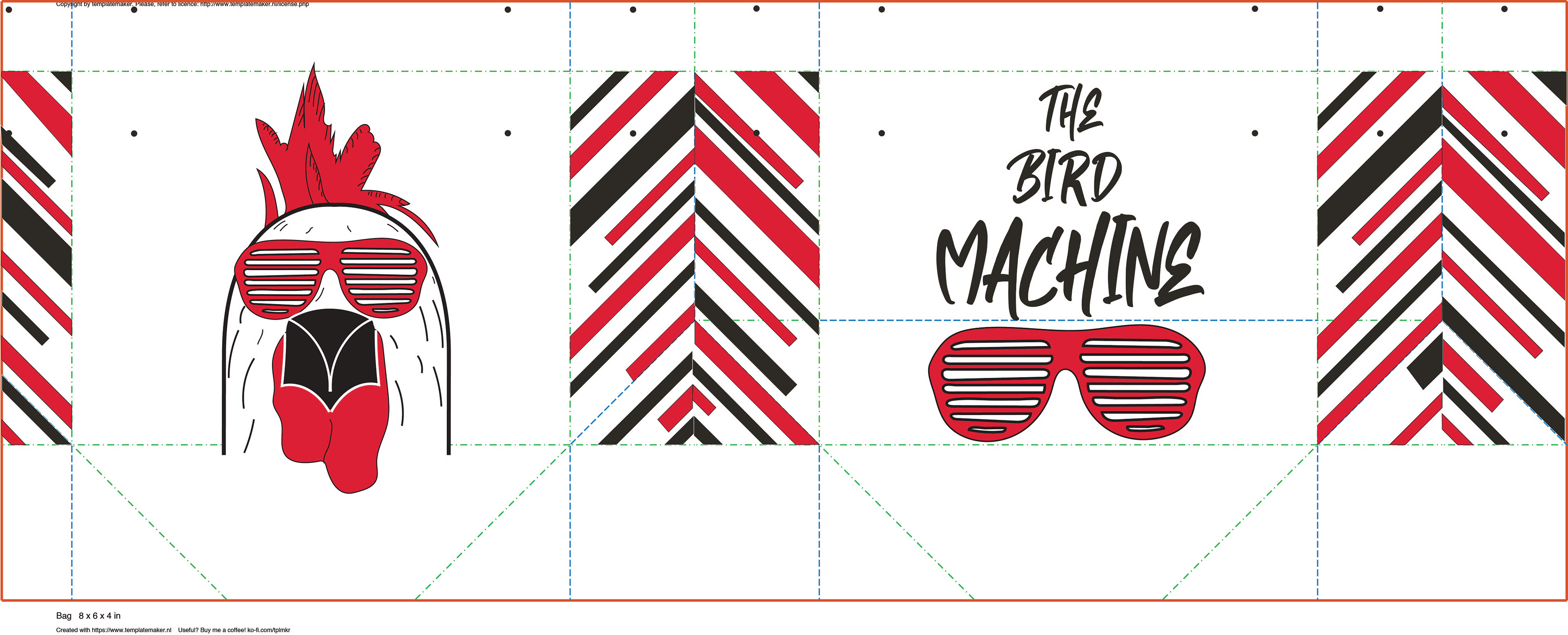
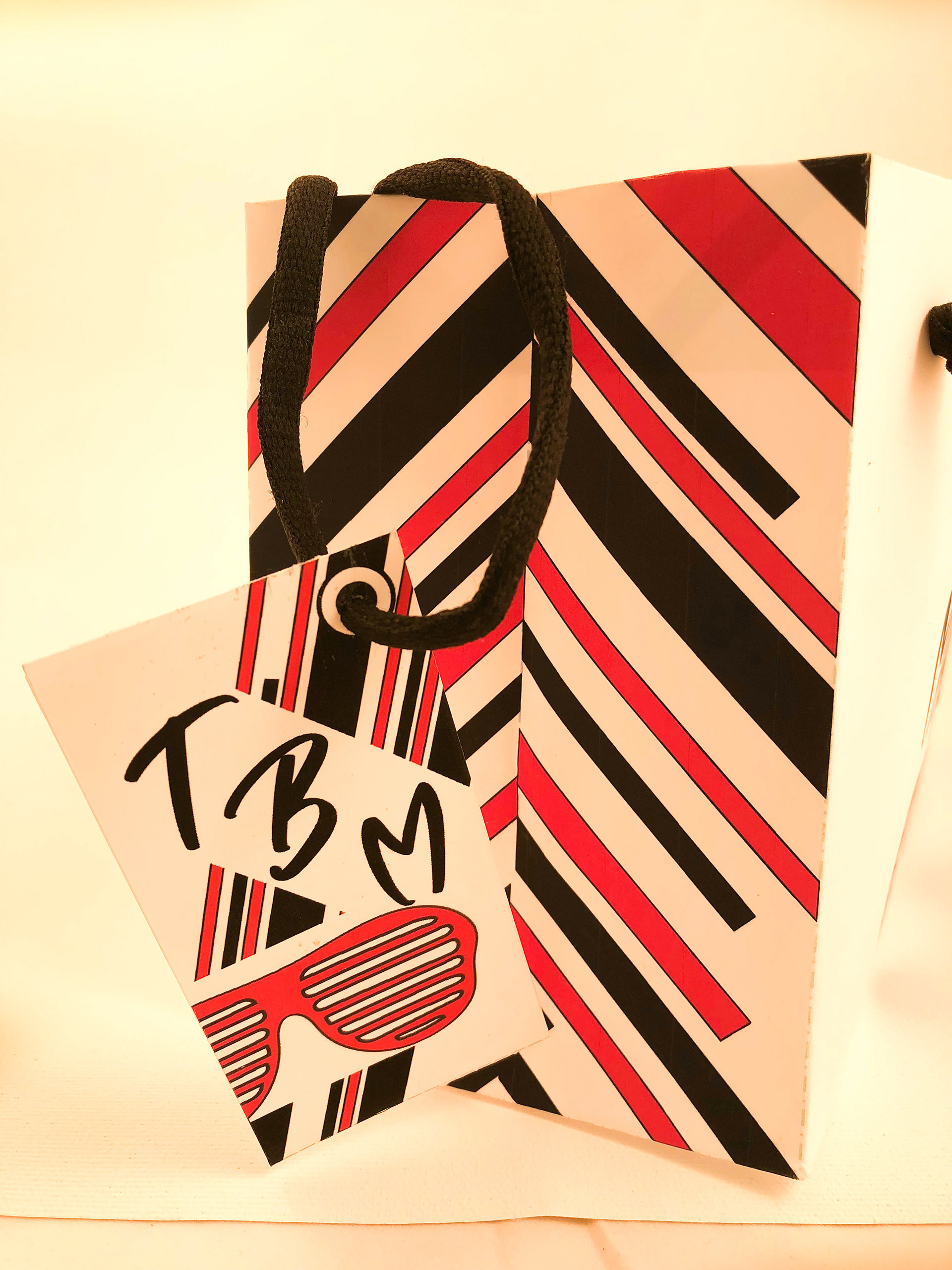
Layout of the bag design shows where folds will be made as well as hole placement. The logo design placed on the left by its self while on the right the text along side the shutter shades sits on the right. For the in between sit slanted black and red lines decorating the sides.
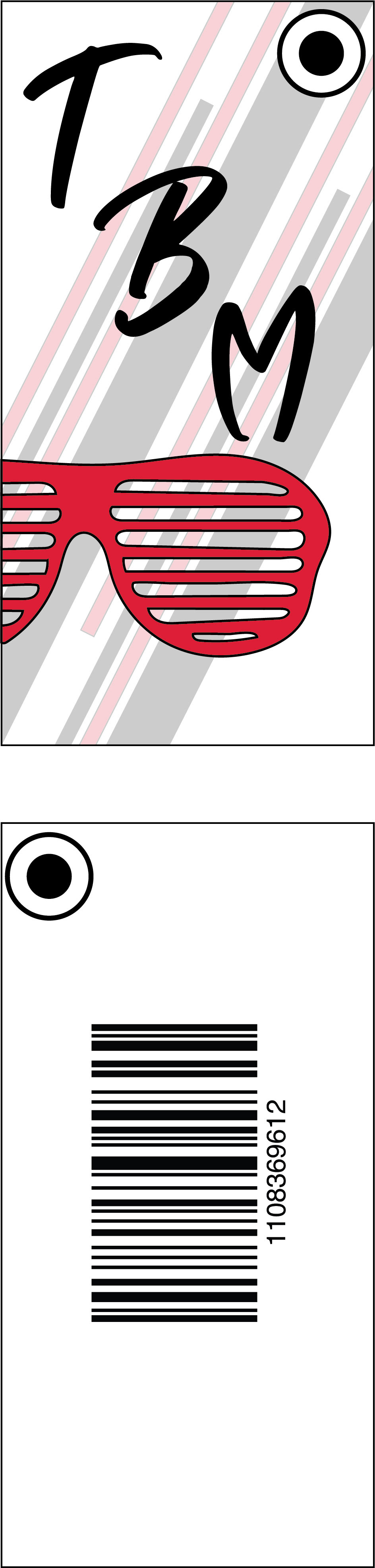
The tag contains the same shutter shades but sitting partially out of frame. The text is shortened to initials to save space.
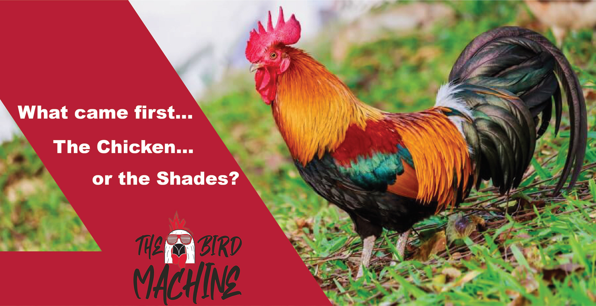
The finished ad is set as weird and funny playing with the phrase "what came first the chicken or the egg?"
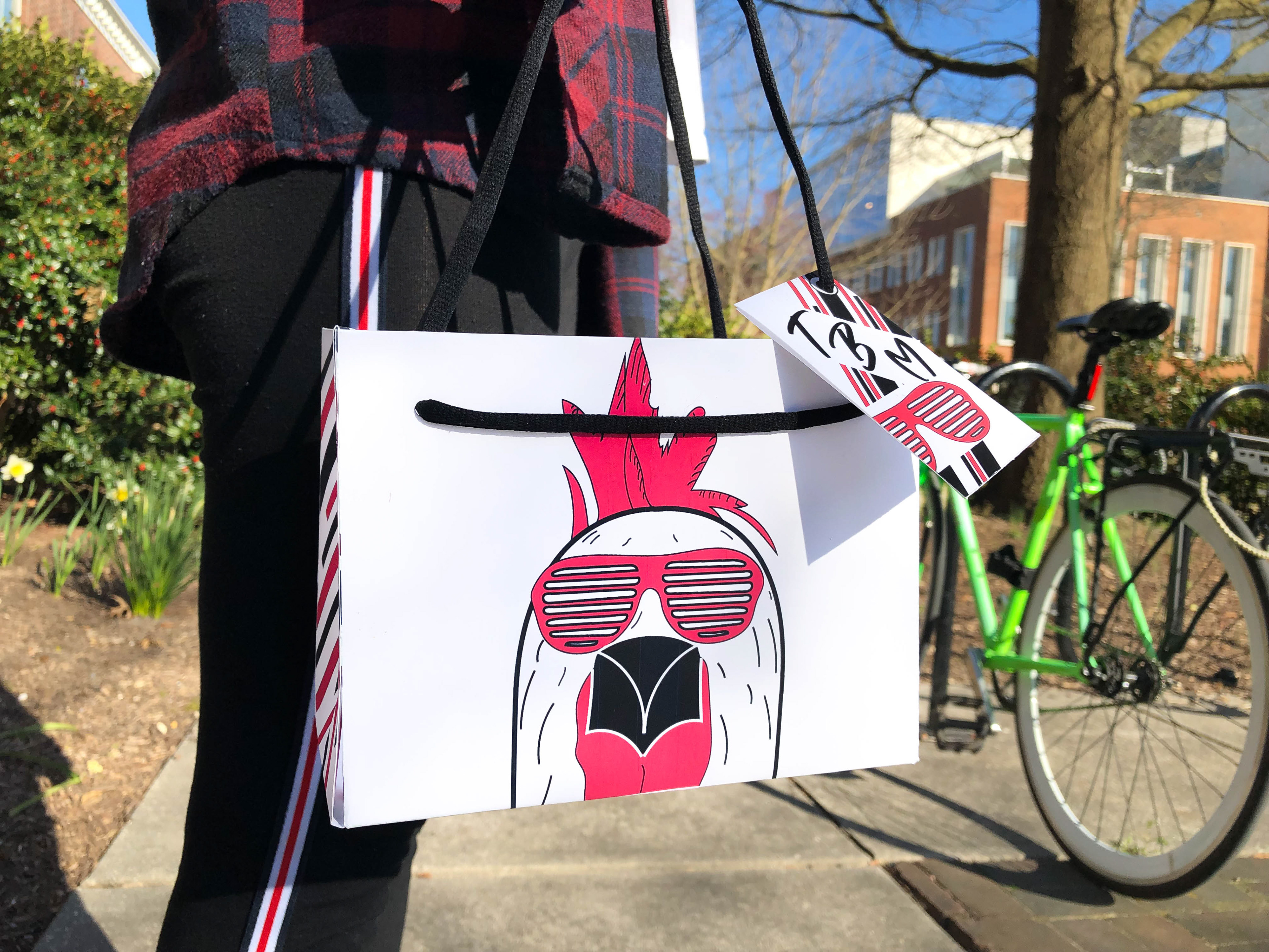
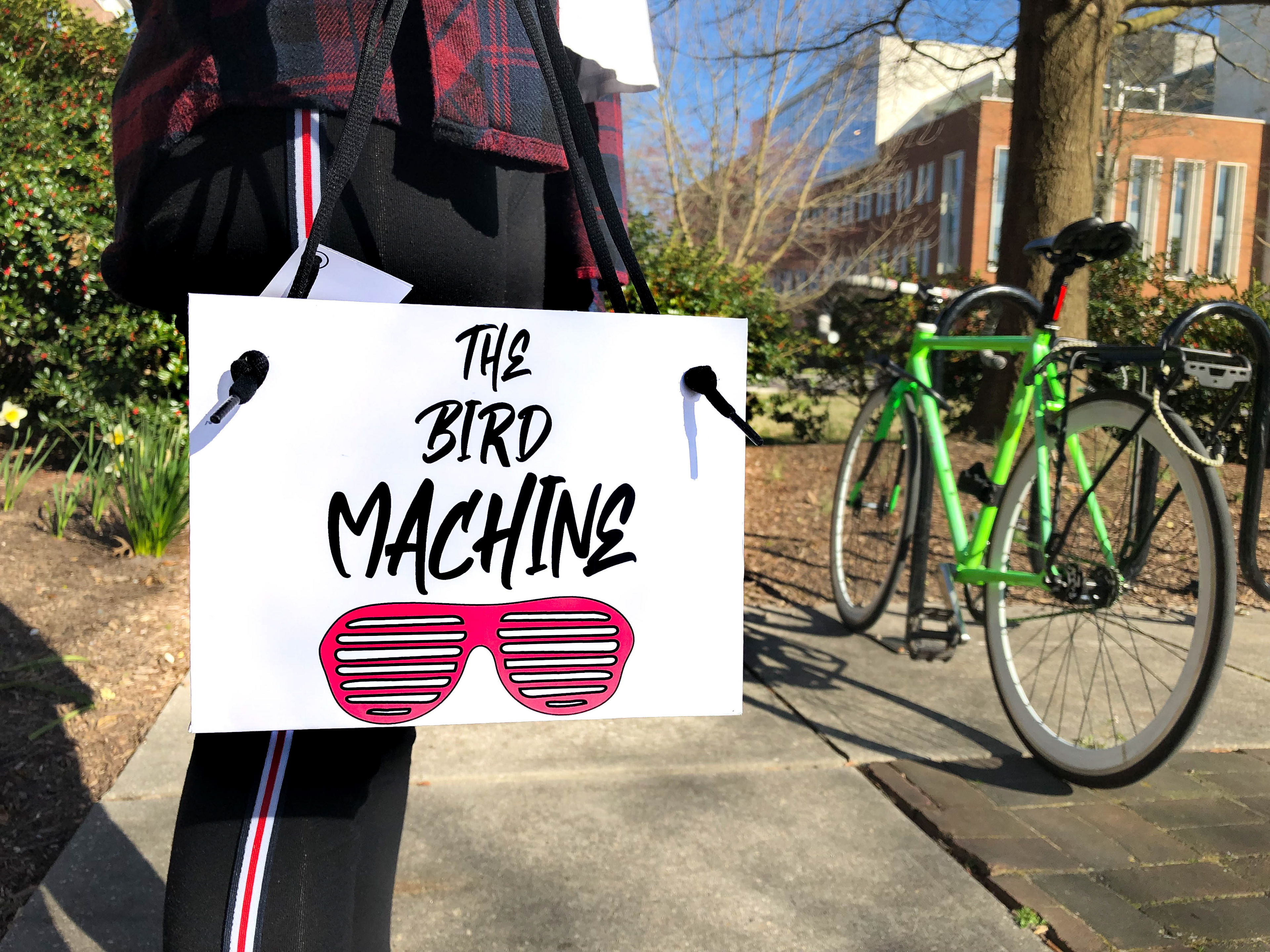
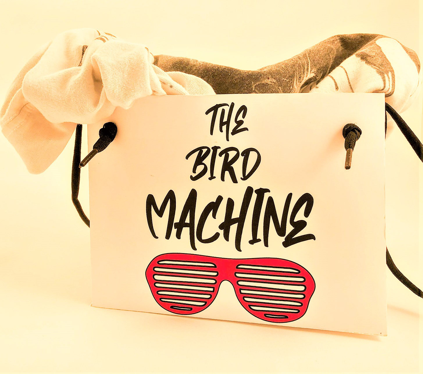
the finished bag design is held with a shoe string giving the 90's urban feel.