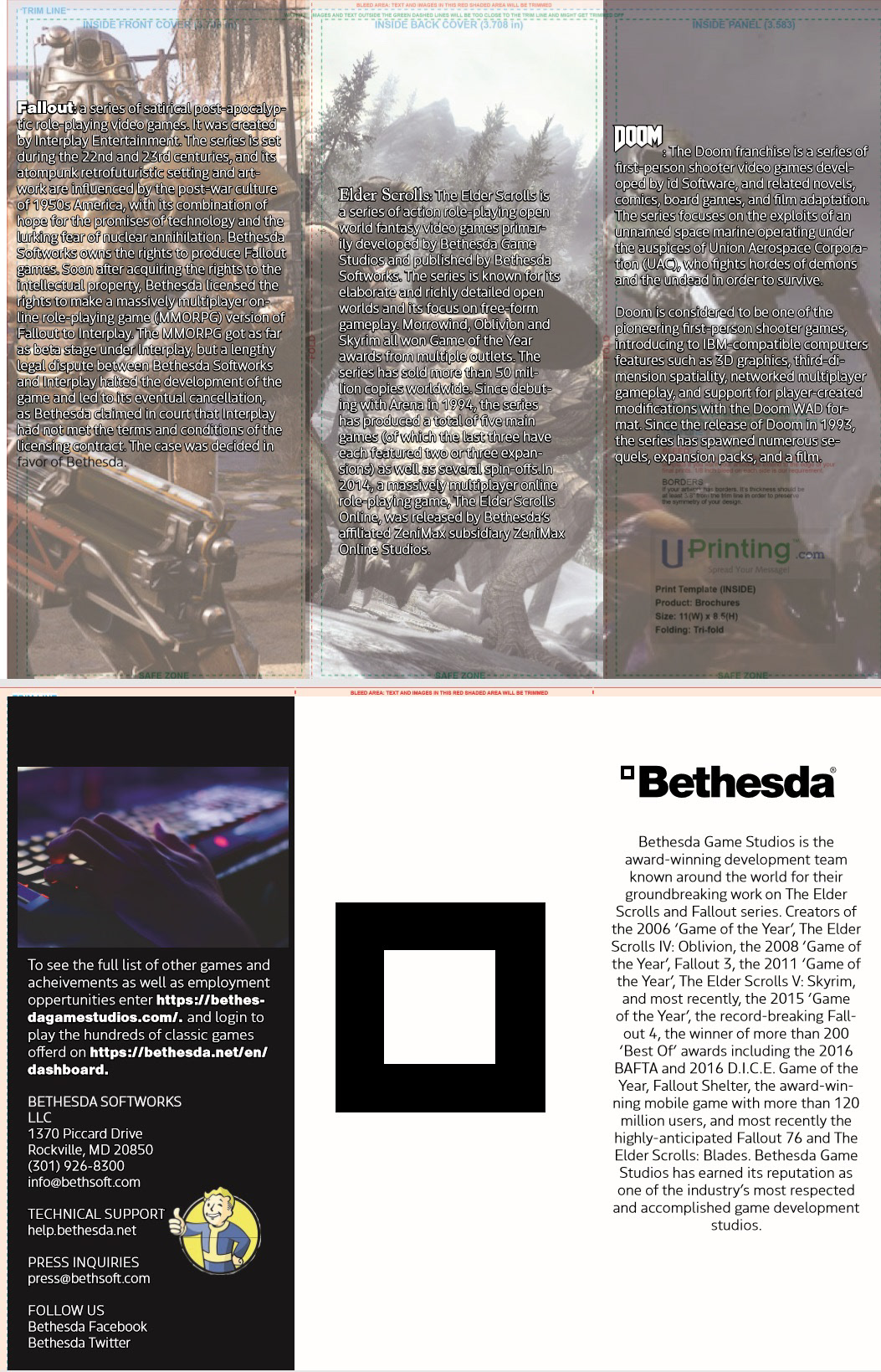
For this project we are to create a brochure for a company of our choosing, I choose Bethesda Game Studio

For the first design I placed the images on a brochures template each column on the inside has three games that the company created and are well known for. on the outside the company name as well as their story sits on the front with their contact information sits on the back. In the middle sits the Vault boy a character that the company created.
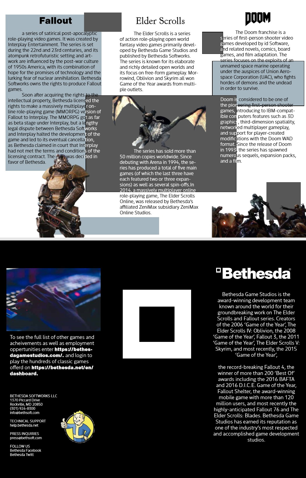
Second iteration I changed the inside panels to have the in game images displayed with a low opacity with the game descriptions overlapping them. Each title of the game would use their original front, however this is not clearly legible to read. Outside I moved the Vault boy to the back panel as a type of favicon and changed the background color of the front and center panel to white and the image and letters to black. The square that sits in the center is the square that sits next to the Bethesda name.
Third iteration went back to the first version but with the use of square blocks to go with the design of the studios website, different colors of the shapes and the words gives legibility to the information and visual interest. The front and center panels have their colors reversed.
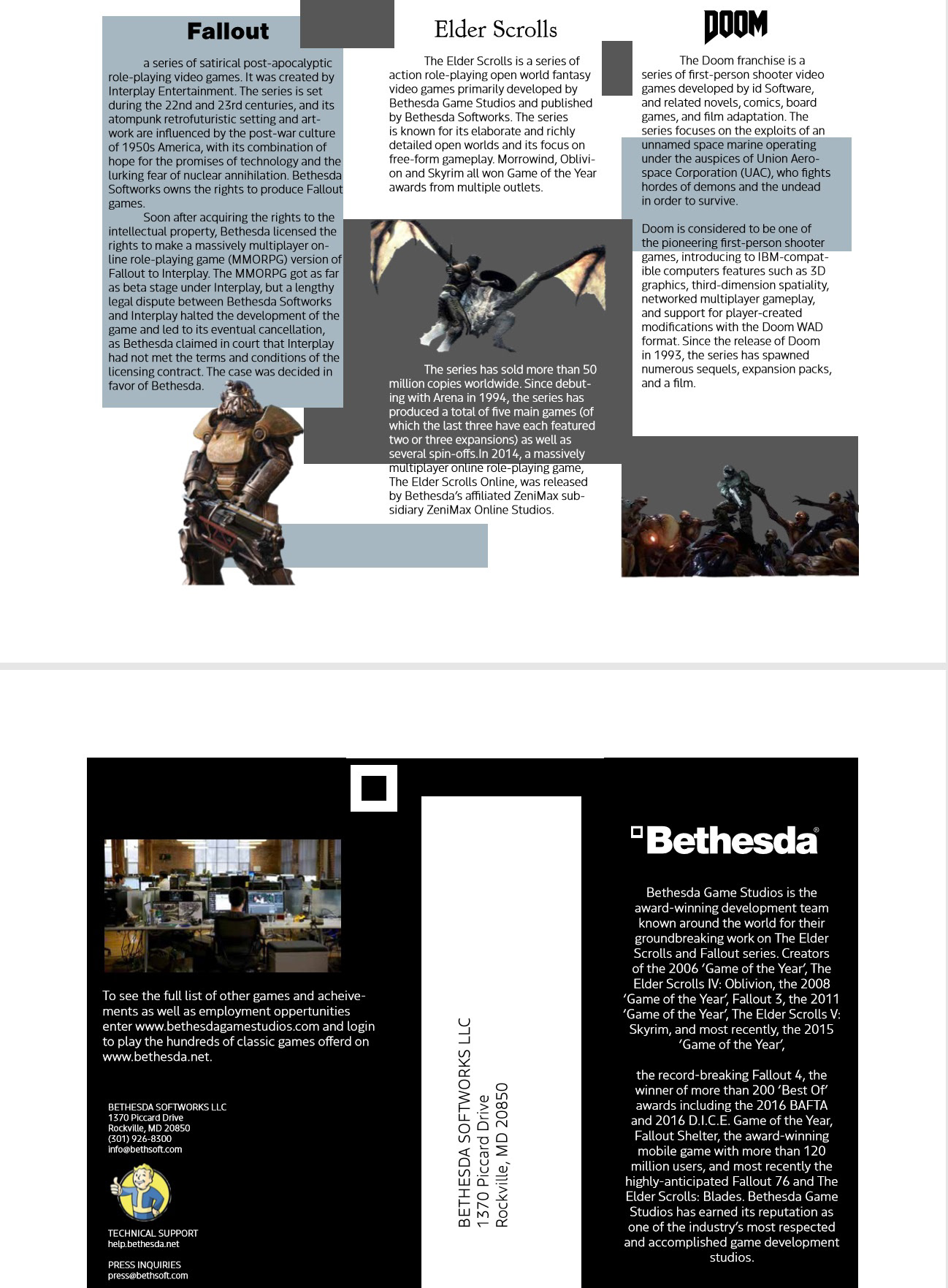
The final version has the inside panels the same with the changes made to the outside panel with the back panel image changed to the inside of the studio. Center panel is replaced with the return mailing list with the square placed at the top left corner.